UX Redesign & Web Development Project
Project Overview
Elevacion1250 Tequila is a new, up-and-coming tequila brand that is poised to make an impact in the world of premium Tequila. The brand is based in Ontario, Canada, and produced in Amititán, Mexico. They have a focus on high-quality ingredients and an authentic production process, as well as giving back to the local community that produces their Tequila. Elevacion1250 Tequila needed a new website & graphic design that would reflect their brand identity and connect with their target audience, which includes younger professionals and tequila lovers.

Tools
Figma, WordPress, llustrator, Elementor, HTML, CSS, Javascript
Duration
1 month
My Roles
Developer, UX Designer, Graphic Designer, Project Manager
Research
- Canadian tequila market valued at $308.27M in 2021.* Expected to reach $403.58M by 2028 – CAGR of 3.62% (2022-2028).*
- Popularity of tequila is growing amongst LDA – 45 with more and more celebrities putting their names to products raising awareness of its quality and versatility in premium cocktails – more than just Margaritas.
- Of the top 10 largest markets for tequila growth, the fastest-growing is Canada, where agave-based spirits are expected to grow 93% by volume and 109% by value from 2021 to 2026.**
- Tequila brands that support women’s empowerment are garnering more attention through the media and larger demographic of women finding a new appreciation for the spirit itself.*
- Millennial women started having an appreciation for flavoured tequilas with 21 Seeds in the U.S. being the most recognizable brand with heavily targeted “women empowerment messaging/marketing – which was acquired by Diageo for $10M(USD) only three years post launch.*
** Source: “Americans Will Spend More on Mezcal and Tequila This Year Than Whiskey” Bloomberg News, July 8, 2022
Problem Space
Elevacion1250 Tequila was facing a problem with their online presence. Their existing website, which was built using a generic WordPress theme, didn’t reflect the brand’s unique identity or connect with their target audience. The site lacked any clear messaging or draw, which made it difficult for the brand to engage with potential customers.
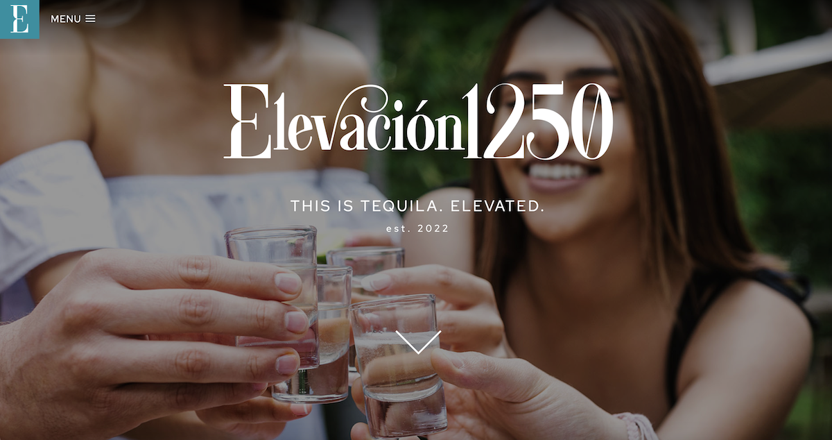

The old Elevacion1250 Tequila website used generic typography, had no clear design/brand color scheme and relied heavily on stock imagery, all of which made it difficult to differentiate the brand from its competitors.
The website was built using a generic WordPress theme, which meant that it did not have any unique identity to stand out in the competitive booming Tequila market. The site lacked a clear messaging hierarchy, and visitors were left uninspired and made the whole experience quickly forgettable.

User Persona
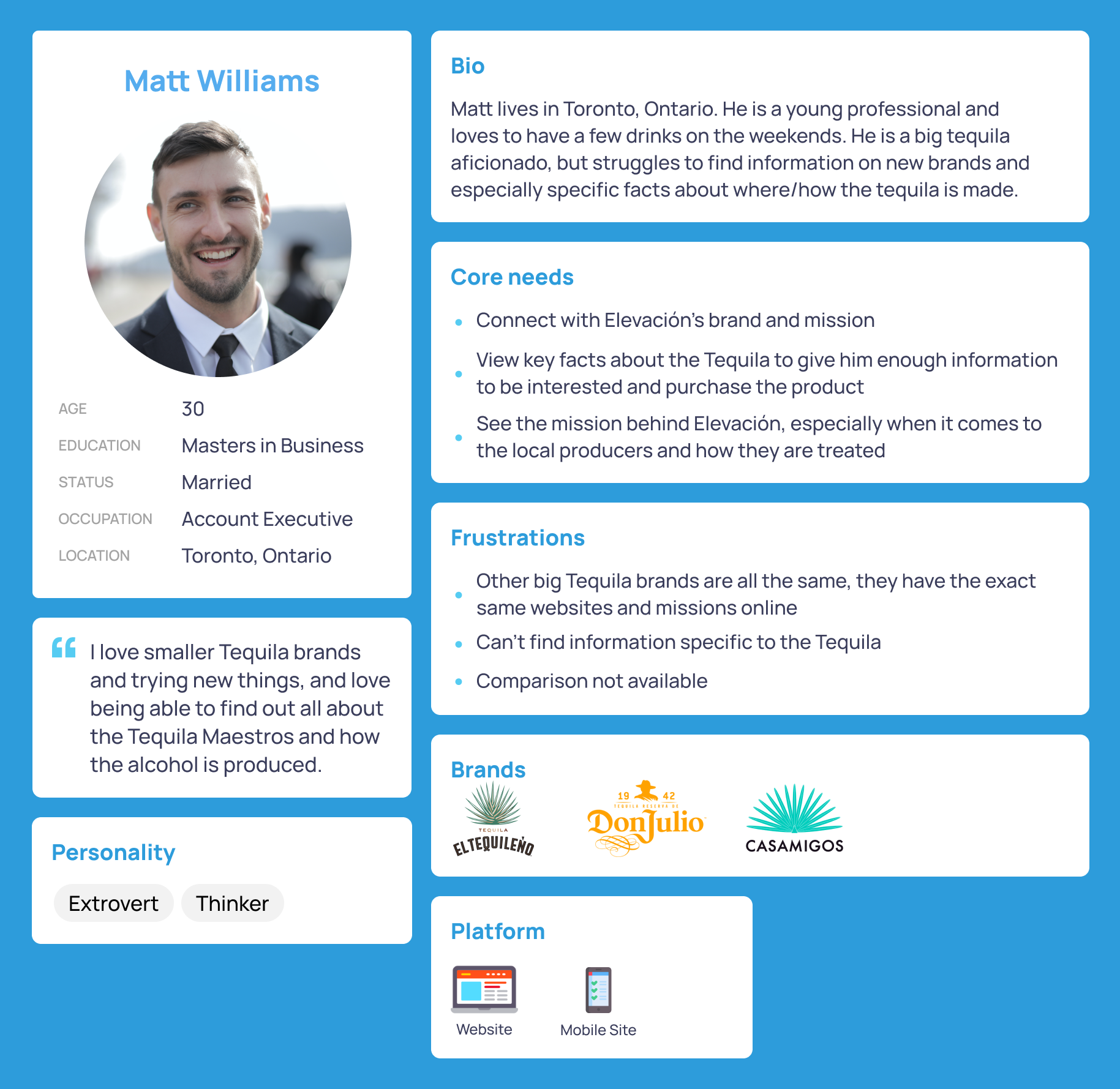
In the Elevacion1250 Tequila website redesign project, creating a user persona was crucial to ensuring that the new site would connect with the brand’s target audience of young people and tequila lovers. Without a clear understanding of their needs, preferences, and pain points, it would have been challenging to design a site that would effectively engage with this group. By creating a user persona, I was able to develop a site that not only captured the brand’s unique identity but also connected with its target audience in a meaningful way.
Task Flow
Creating a task flow was critical to ensuring that the new site would be easy to use and navigate for its target audience of young people and tequila lovers. By mapping out the steps that users would take to complete common tasks on the site, such as browsing products or learning more about the brand, our team was able to identify areas for improvement in the site’s navigation and content structure.
Wireframing
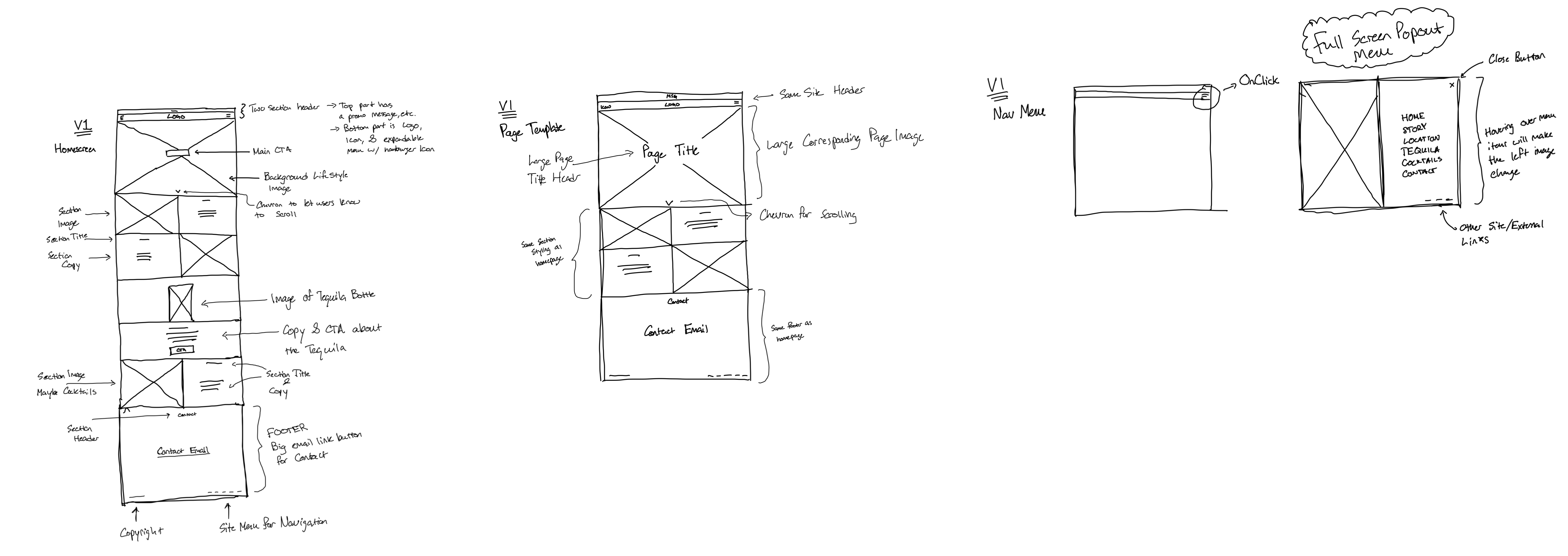
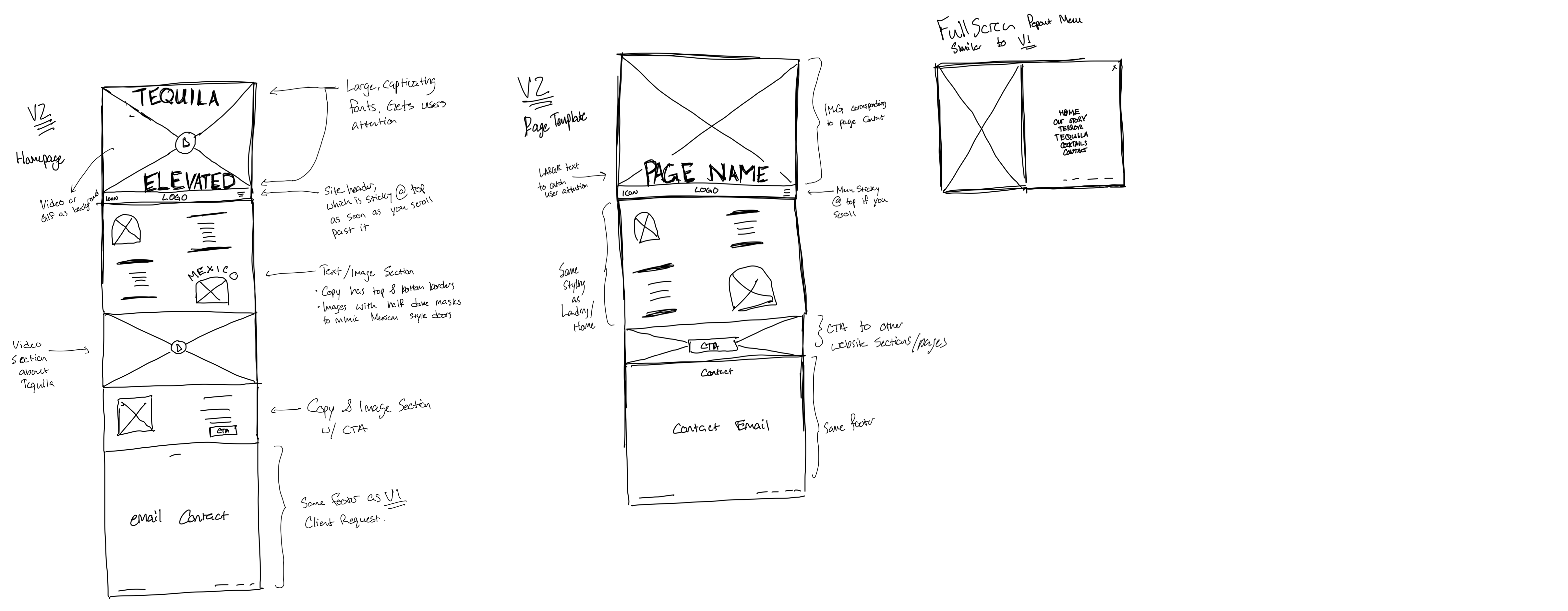
The wireframing process began after I had created user personas and task flows. I started with a low-fidelity wireframe, which was a rough sketch of the site’s layout, navigation, and content structure. I used these wireframes to test different design concepts and gather feedback from my client and their target audience.
Based on the feedback I received, I iterated on the wireframes to create a version 2 (V2), which included more specific details about the site’s layout, typography, and functionality. I continued to refine the wireframes based on user testing and feedback until I arrived at a design that met the client’s goals and user’s needs.
Website Development
With my Task Flows, User Persona, and especially the wireframes, I began the development process of Elevación’s website. They had the old site built with WordPress & Elementor, and since I had experience with both of those technologies, we decided the easiest way forward was to keep the old site and develop a staging site within it, using the same technology. I added in custom HTML, CSS and Javascript, but used Elementor as a page builder and WordPress CMS functionality.
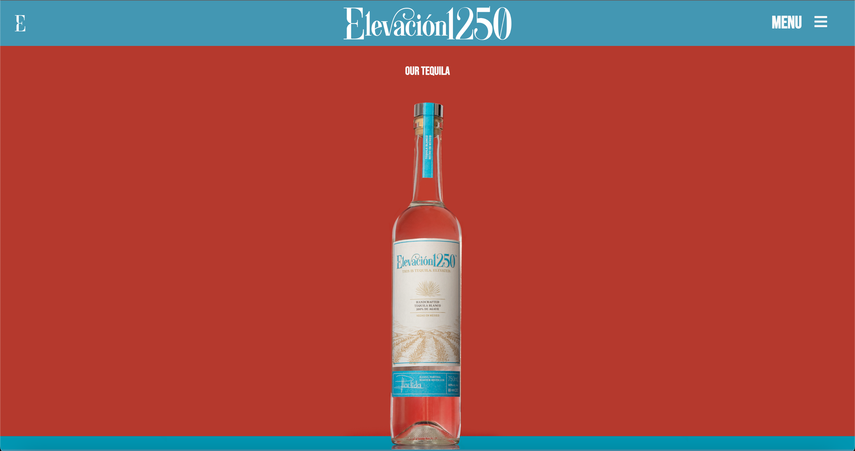
Within the staging site I created, I had to delete all the old material, including getting all the prebuilt theme items, old media, etc. I sourced some new photography, and chose a color scheme for the site.
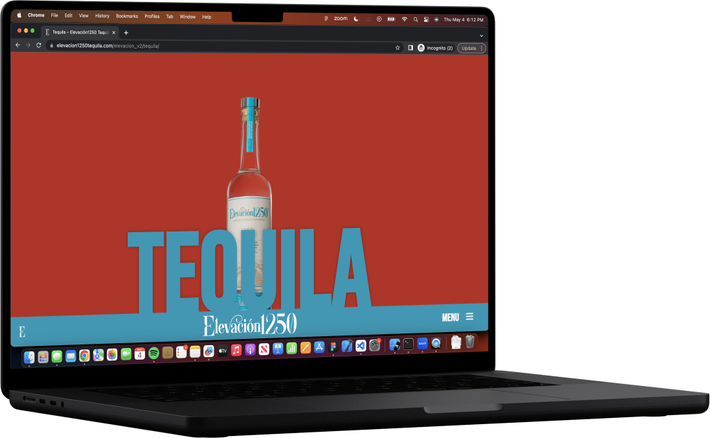
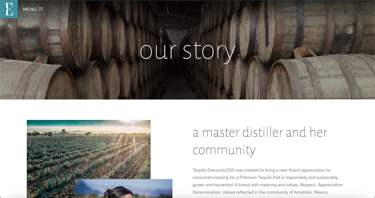
Style choices like large text with brand colors kept users engaged with the site’s content. I paid careful attention to the site layout to ensure that it was easy to navigate, and users always knew where they were on the site with large Page Headers.
I created a custom site design, moving away from generic themes, to create a more authentic and cohesive brand experience for Elevacion1250 Tequila. The site design was specifically tailored to the needs and preferences of the target audience, resulting in a more engaging and satisfying user experience.


Navigation Development
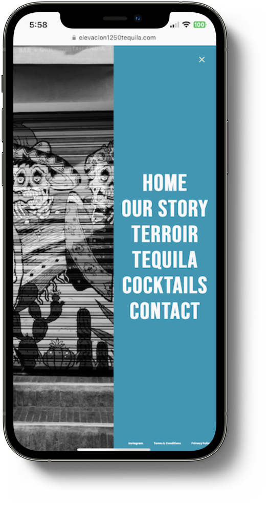
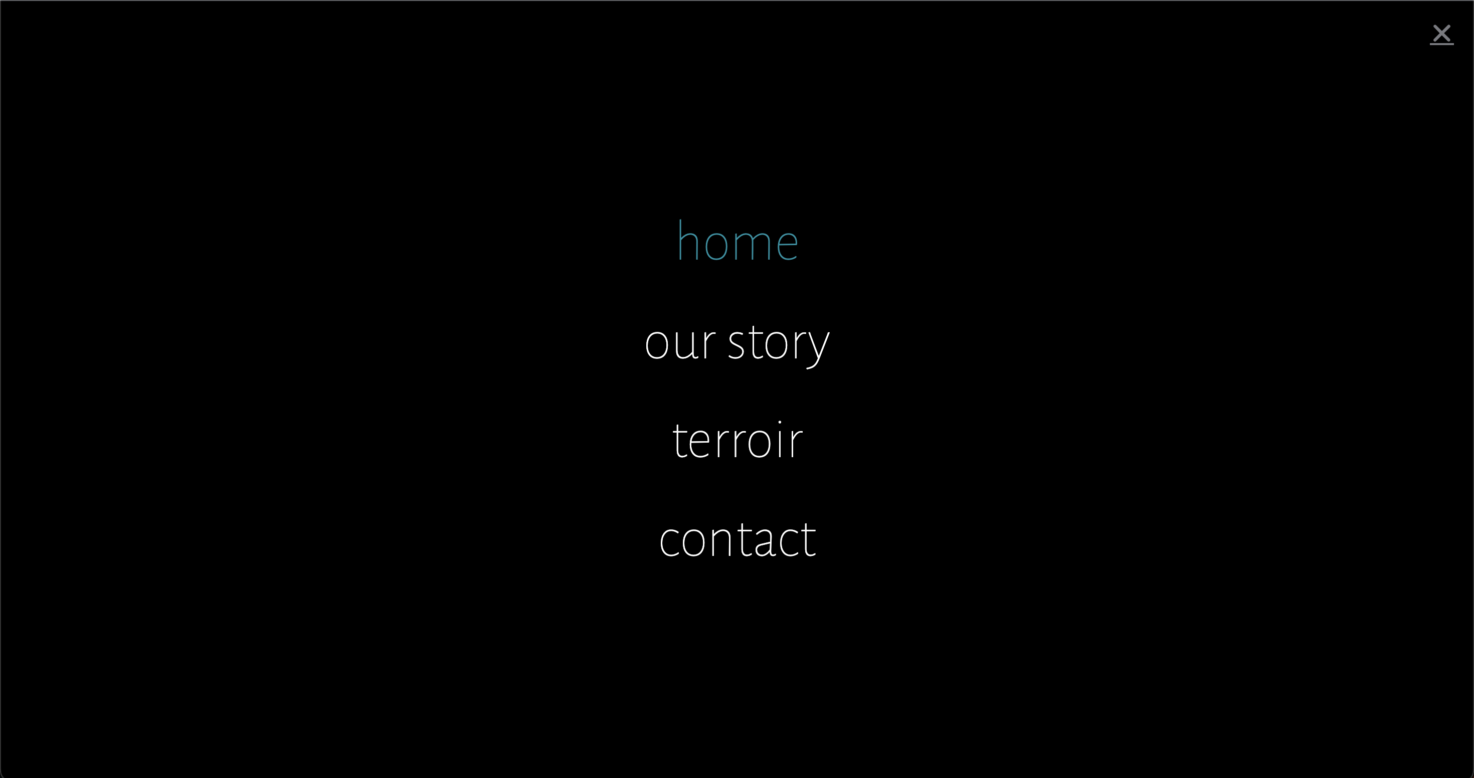
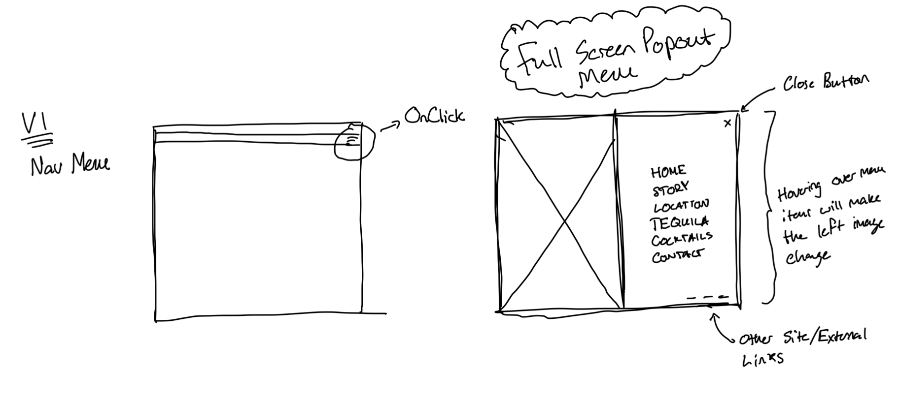
A big differentiator between Elevación’s website and other tequila brands is the Navigation Menu. My clients wanted a cool hover effect to be built in, with a full screen popup menu. After wireframing it, I realized I would need to custom code this menu.
					<style>
.showhover-2, .showhover-3, .showhover-4, .showhover-5, .showhover-6 {
    transition: 0.5s;
    display: none;
}
</style>
<script>
jQuery(document).ready(function() {
    jQuery('.hovertoshow-2').each(function(j){
        jQuery(this).hover(
            function(){
                jQuery('.showhover-2').eq(j).show();
                jQuery('.showhover-1').eq(j).hide();
            } ,
            function(){
                jQuery('.showhover-2').eq(j).hide();
                jQuery('.showhover-1').eq(j).show();
            }
        );
    });
});

jQuery(document).ready(function() {
    jQuery('.hovertoshow-3').each(function(j){
        jQuery(this).hover(
            function(){
                jQuery('.showhover-3').eq(j).show();
                jQuery('.showhover-1').eq(j).hide();
            } ,
            function(){
                jQuery('.showhover-3').eq(j).hide();
                jQuery('.showhover-1').eq(j).show();
            }
        );
    });
});

jQuery(document).ready(function() {
    jQuery('.hovertoshow-4').each(function(j){
        jQuery(this).hover(
            function(){
                jQuery('.showhover-4').eq(j).show();
                jQuery('.showhover-1').eq(j).hide();
            } ,
            function(){
                jQuery('.showhover-4').eq(j).hide();
                jQuery('.showhover-1').eq(j).show();
            }
        );
    });
});

jQuery(document).ready(function() {
    jQuery('.hovertoshow-5').each(function(j){
        jQuery(this).hover(
            function(){
                jQuery('.showhover-5').eq(j).show();
                jQuery('.showhover-1').eq(j).hide();
            } ,
            function(){
                jQuery('.showhover-5').eq(j).hide();
                jQuery('.showhover-1').eq(j).show();
            }
        );
    });
});
jQuery(document).ready(function() {
    jQuery('.hovertoshow-6').each(function(j){
        jQuery(this).hover(
            function(){
                jQuery('.showhover-6').eq(j).show();
                jQuery('.showhover-1').eq(j).hide();
            } ,
            function(){
                jQuery('.showhover-6').eq(j).hide();
                jQuery('.showhover-1').eq(j).show();
            }
        );
    });
});
    document.querySelector('#contact1').addEventListener('click', function() {
  document.querySelector('.dialog-close-button').click();
});

</script>
Graphic Design
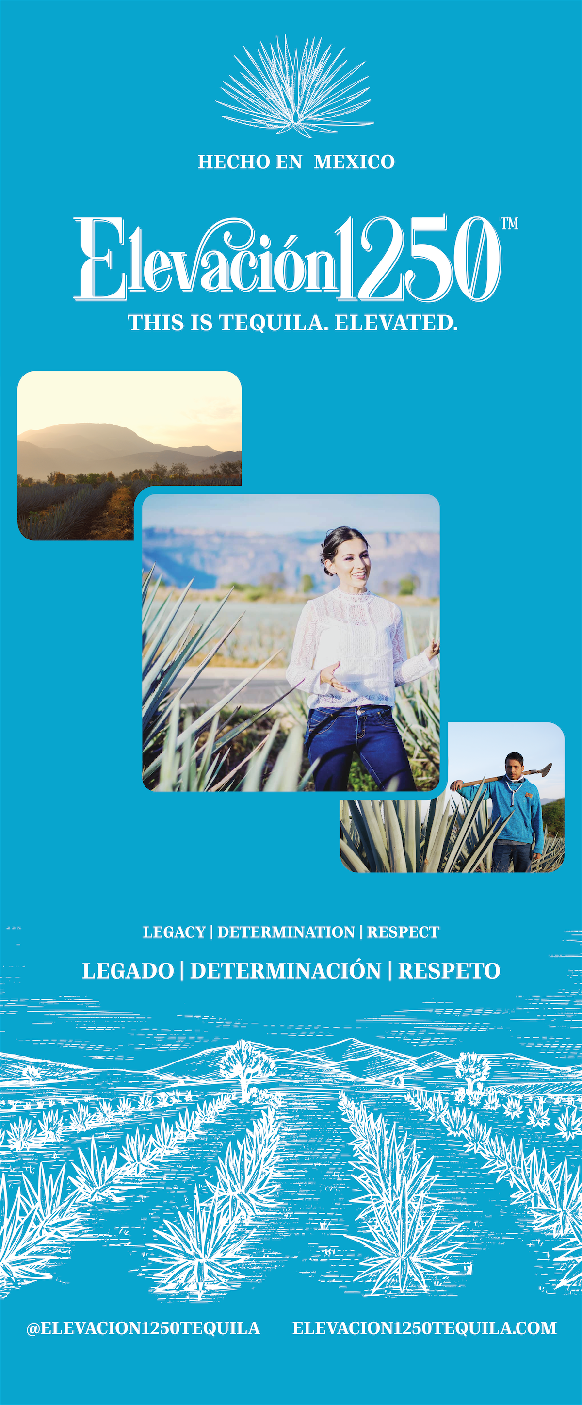
While developing the website for Elevación, my clients also needed graphic design work done. As a new alcohol brand in Toronto, Ontario approaching the summer season, they needed design work done for festivals and events. I created banners and other assets to be used at these events. I designed these in Adobe Illustrator, and made sure the quality and design work was up to par and matched the brand’s overall style.
Thank you for reading!
